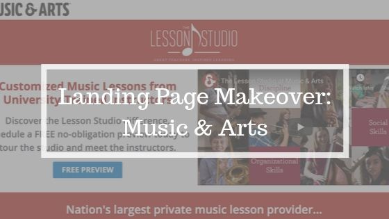
When you’re trying to improve your conversion rate, real examples are helpful. But rather than simply tear down an existing landing page, I actually created an improved version. That way you can see the concepts in action.
For this exercise, I made over a page promoting music lessons for a company called Music & Arts that I found through a paid search ad on Google. Here’s what it looks like as I’m writing this post and how I would optimize it for more conversions.
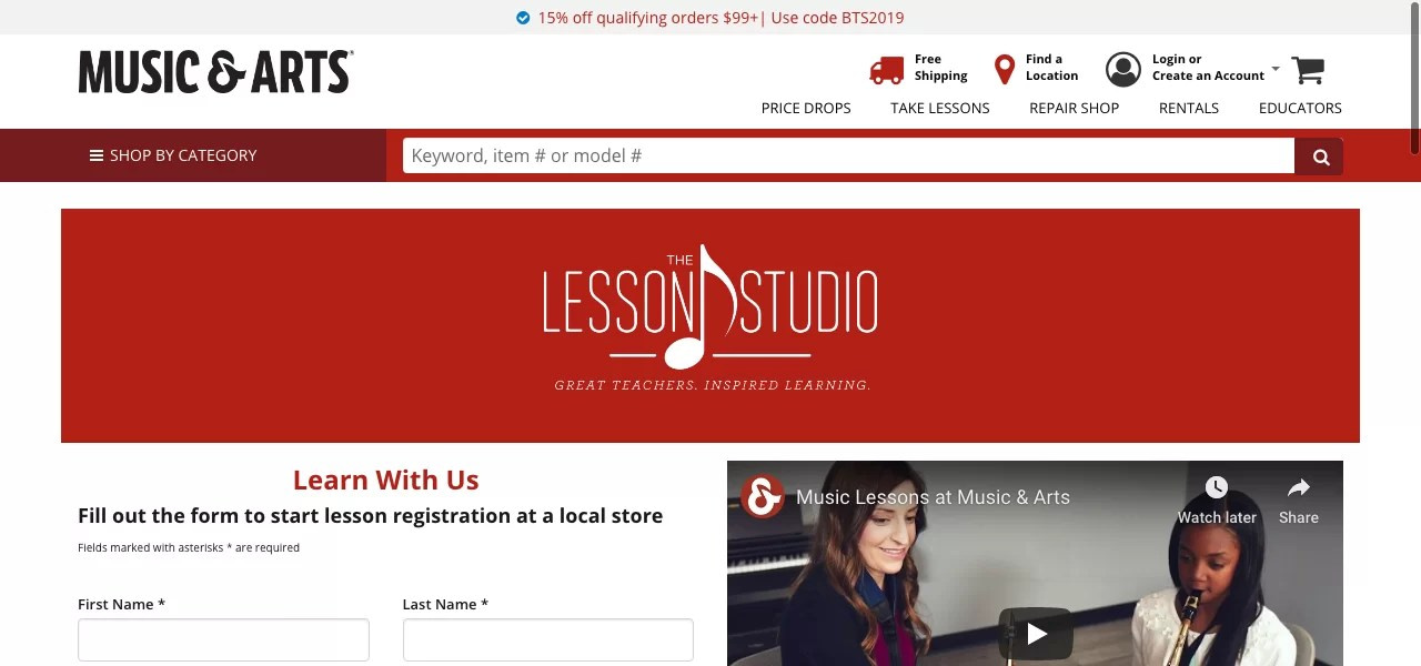
BEFORE

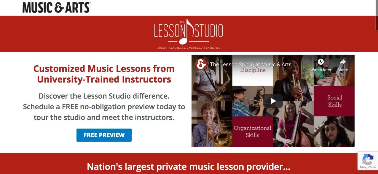
AFTER

One of the first things you’ll notice about the original is that this is a regular page on the site rather than a dedicated landing page created for the PPC campaign. That makes conversion more challenging. Visitors can be coming from just about any source, for a variety reasons. To appeal to them, the page has to be a bit general.
Then there’s the site navigation. It can be helpful when visitors need to find what they are looking for. But it can also take them away from the page before they’ve completed your desired action.
That’s why I recommend creating dedicated landing pages for all conversion-focused campaigns. And that’s just what I did with my makeover. Let’s take a closer look.
Hero area
The top of any landing page is the most valuable area you have to work with. That’s why the top section is often referred to as the hero section. It won’t matter how good the rest of the page is if you don’t convince readers to continue on.
Unfortunately, the current page falls flat. Logos, navigation and irrelevant content, such as the offer at the very top of the page, take up over half of the area visible above the fold. The form and a video are only partially visible.
While the copy that does show tells you what it is you should do as a visitor, it doesn’t provide much of a reason to do it.
Since my makeover page is a dedicated landing page solely focused on conversions, I removed all the links and functions that could distract from the objective. I also made the Lesson Studio logo smaller so that the headline and offer stand out more. As a result, the entire hero section is visible above the fold.
Even more important, it allows me to feature a more targeted offer. If people are coming from an ad with the search term music lessons, it’s safe to assume that they are exploring their options rather than looking to commit to a specific provider.
I found the perfect one in a line at the end of the video, which mentioned touring the facility and meeting the instructors. It’s much easier to get a visitor to do that then sign up for lessons sight unseen.
Social proof callout
The offer wasn’t the only nugget I found buried in Music & Arts’s current material. Amid a long list of bullets was this statistic about providing over 1 million lessons! That’s the sort of social proof that builds credibility and helps you stand out from the competition.

As you can see, it makes an effective callout below the hero section. Not only does it provide a visual separation between sections, it provides the perfect transition to the next section with the line “See why so many people of all ages and skill levels choose the Lesson Studio at Music & Arts.”
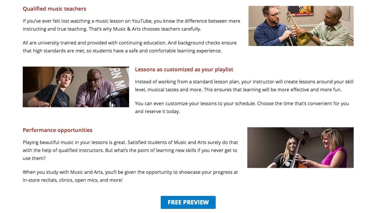
Benefits and features
The hero area usually gets most of the focus. While there’s good reason for that, don’t underestimate how important this section on a landing page as well. Intriguing visitors into reading your page is only part of the job. If you want them to convert, you need to convince.
That’s what the features and benefits section is for. It’s you opportunity to back up your claims, demonstrate your value and highlight your differentiators.
The current page doesn’t do this as effectively as it could. There are several reasons for that.
First, the headings lack punch. Does seeing “Your Curriculum” fire you up so you can’t wait to read more? Me neither.
Next, nothing is really fleshed out here. It’s all just bullet points. Those are great for breaking up long text, but when the whole text is bullets, they lose their effect. And with that many, there’s nothing to focus on. What is really important to the reader?
Even worse, they lack context to make them meaningful. You can’t effectively communicate in bullet points alone. Don’t be afraid to use paragraphs, despite what you hear about nobody reading anything any more.
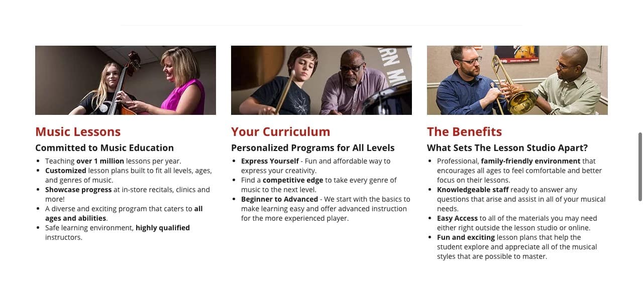
For the makeover, I chose to focus on just the most important selling points and back each up with supporting points that add credibility, context and interest. For example, the text under “Qualified music teachers” reads:
“If you’ve ever felt lost watching a music lesson on YouTube, you know the difference between mere instructing and true teaching. That’s why Music & Arts is chooses teachers carefully.
“All are university trained and provided with continuing education. And background checks ensure that high standards are met, so students have a safe and comfortable learning experience.”
Notice how the comparing it to YouTube lessons gives readers something they can picture and plays on the frustration of not being bale to understand the instructor?
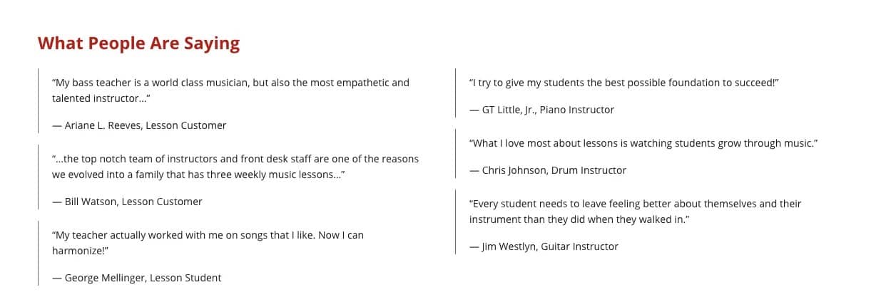
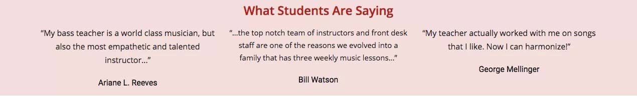
Testimonials
Music & Arts did a good job including testimonials on the page. They are great for building credibility because it’s customers endorsing the company rather than the company making claims about itself.
That’s why I wanted them to stand out more in my makeover. Ideally it would have been great to include a headshot of the people who provided the quotes, but since I don’t have access to the information on these people, I chose to increase the text size and put them in a colored band.
You’ll also notice that I only used half of the testimonials. That’s because the other three are not from students or customers, but from instructors. Since the makeover is a dedicated landing page, I can make it more targeted.
Calls to action and form
The most obvious difference between the current page form and the makeover page form is the positioning. It’s toward the top of the page on the original and at the bottom of the makeover page.
There’s no right or wrong way to handle this. Many successful pages have the form visible above the fold. It does immediately let people know about the purpose of the page.
Ultimately, I decided to move it to the bottom because I wanted to keep the “what happens when you complete the form” copy in close proximity to the form itself. There simply wasn’t enough real estate for all that and the other elements I wanted to lead with.
It provides a nice close to the page as well., which the original doesn’t have. Even if I had left the form at the top, I would have included some call to action at the end.
Without the form at the top to let visitors know up front what they should do, I make sure to include a button which links to the form. In fact, I also included a button at the end of the features and benefits section. This reinforces the offer and makes it easy for visitors to take action.
I made this button blue rather that red to stand out. Since the color contrasts with everything else on the page, your eye is naturally drawn to it. The e-commerce part of the Music & Arts site uses this same color for buttons, so it still fits within the overall brand scheme.
I also wanted the form itself to stand out more, so I encapsulated it with a red boarder. The original blends into the page at first glance.
BEFORE

AFTER

The other thing I wanted to do with the form was reduce the number of fields. The more information you ask for, the more friction you create. Test after test has shown that as the number of fields goes up, conversion rates go down.
Instead of asking for both first and last names, I included a single name field. For this first step, that’s probably all you need. “Are these lessons for you?” is probably not needed either, since Music & Arts can easily ask that when they respond to the prospect. So that isn’t in the makeover form.
Assuming that their funnel includes both phone and email follow-ups, I left those fields. The ZIP code and area of study are also probably needed to match the prospect with the right Music & Arts location, so those fields stayed.
That left the reCaptcha field. The technology is at a point now where reCaptcha can detect suspected robots without requiring a field, so I got rid of that too.
We’re left with a more streamlined form that’s quicker and easier to complete.
My final change was to replace “submit now” with more descriptive button text. Submitting a form isn’t exciting, and it doesn’t give any clues about what will happen next. “Get started” fits the bill nicely.
A couple other notes
You may have noticed that I used a different video than the original page. I did this because the one in the makeover fits the messaging of that page a bit more closely. I didn’t produce this video, so I won’t write too much about it, but you can view them both and see for yourself.
On a desktop or laptop, there was an empty space after the copy next to the form. I added the arrow to fill that space as well as visually connect the copy to the form and draw added attention to it.
If you’d like help optimizing your pages for conversions, please contact me.
Leave a Reply