How do get website visitors to not just understand a complex technology solution, but also interested enough to take action?
That’s just one of the challenges I addressed in this makeover for the home page of Lakebed.io, an early stage startup in the tech space. Keep reading beyond the before and after images for a detailed breakdown.
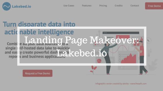
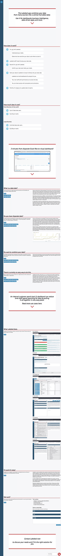
BEFORE
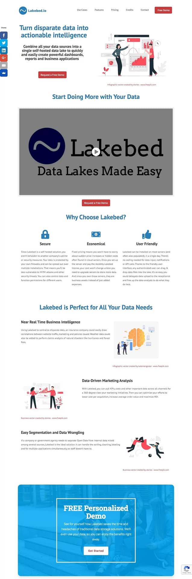
AFTER
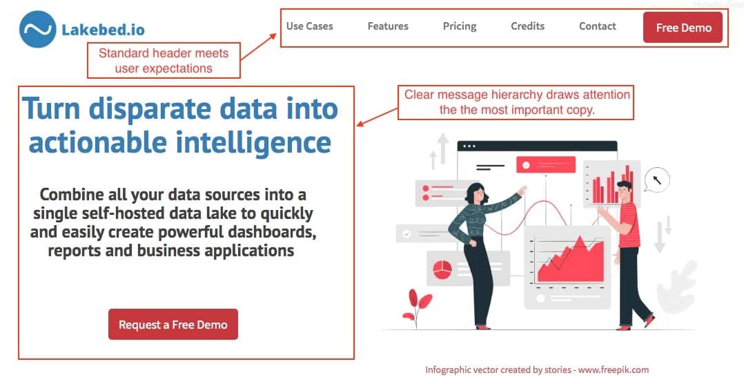
First Impression
First impressions matter online. You only have a few seconds to grab attention and pull visitors in. The current home page doesn’t do that.
There’s just not much visual interest or intrigue in the hero message. It simply says what the product it does, but not why anyone would want it.
What’s more, there’s mo visual hierarchy to draw my attention to as a starting point.
The made over hero area leads with strongest benefit to give the page the best chance of grabbing readers early. The copy that follows then adds more context, which leads to a strong call-to-action. That’s a hierarchy that’s proven to be effective.
I also created a more standard header with a logo, main navigation and a call to action button to improve the user experience. On the current page, the navigation only visible by hovering over the icon.
Note: since this landing page makeover only includes the home page, I kept the links to the current pages.
Simplified Messaging
Data lakes are a pretty complicated subject, especially for people who may be unfamiliar with the term. The current site doesn’t do a bad job of explaining it, but it takes too many words to it. Lengthy explanations work well for blog posts, but not home pages.
The home page makeover solves this in a couple of ways.
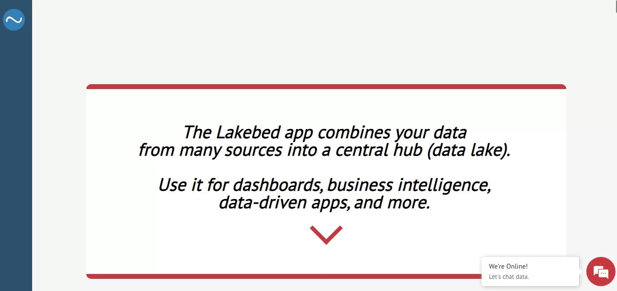
The first is by including much of the information in an explainer video. This format is not as intimidating as a big block of text. So you can do more explaining. Plus, the animations help hold visitors’ attention. You can view the video on my revised Lakebed home page.
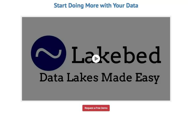
Since the home page makeover is strictly for illustrative purposes, I didn’t spend money on a professional voiceover or the pro version of the software I used to create it. That would make it even more effective. Even without those touches, though, it’s a big improvement on the current page.
The second way I simplified the page was by scaling back the amount of information provided. This isn’t the type of product that people will purchase after a reading a web page, no matter how much information it has. So there is no need to get into all the technical details right away. You just need to give enough to get visitors to take the first step.
In fact, much of the copy on the current page could actually be preventing people from moving forward. Take the “How does it work” section, for example. A couple of hour-long calls is a time commitment and sounds like a fair amount of work.
I also chose not to include the price on the home page makeover. I know it’s often the first thing people look for, but for a high ticket product like this, it’s better to demonstrate the value first. You want people to view it as an investment rather than a cost.
Improved Design
Normally, I only worry about aesthetics after everything else is nailed down. But in this case, the complexity and length of the copy compounds the issue. To keep people from bouncing, it’s an area that needs to be addressed.
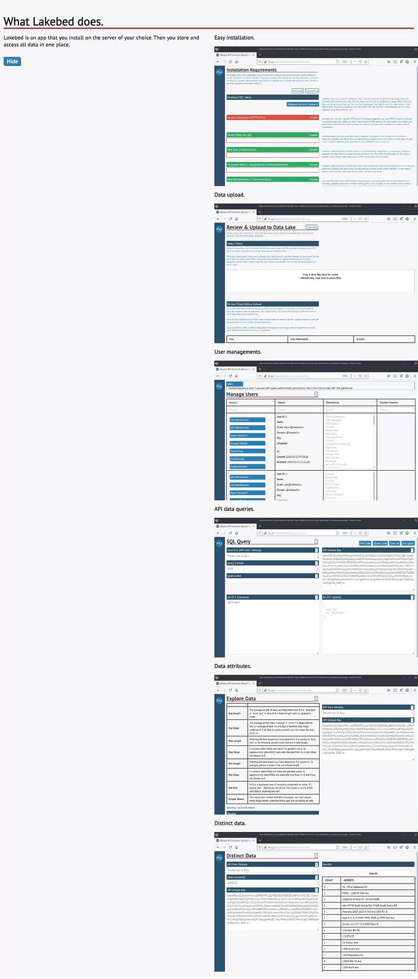
My first thought was to include nice, big product shots, but the product isn’t overly visual, as you can see from the screenshots. I could show a dashboard or other data visualization tool that you can build with the data, but that could misrepresent what the product does and shortchanges the value it provides.
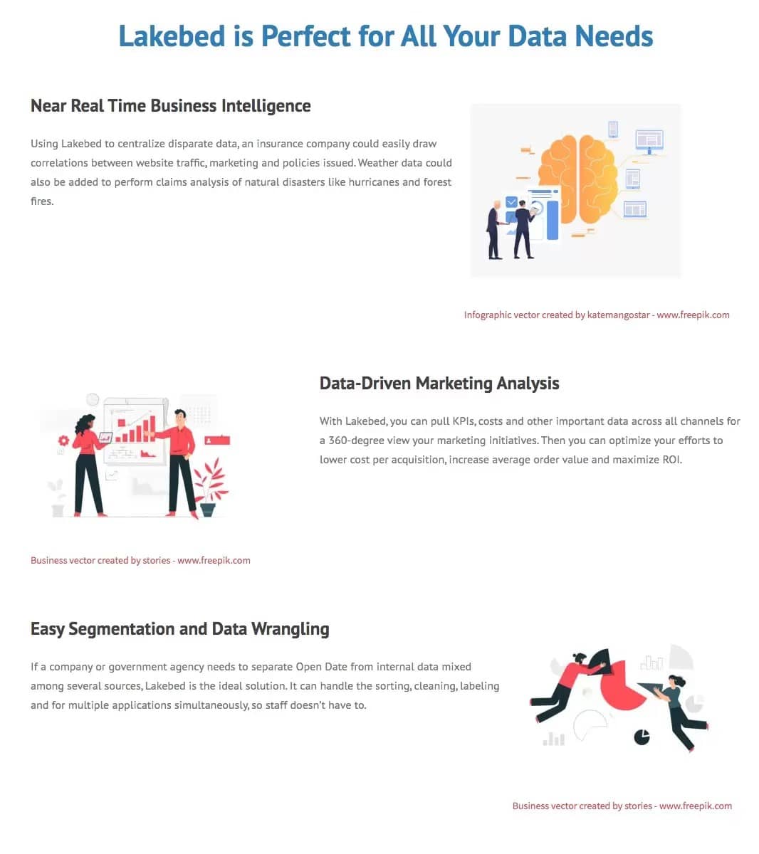
Illustrations were the perfect choice for a couple of reasons. The simplicity of these images counters the complexity of subject. And the conceptual nature of the product is better represented by illustrations than photos.
Refined Offer
The current site has a bit of a mismatch between offer and call-to-action. In one spot, “Give us a try” leads to a generic contact form. In another, visitors are directed to contact the company to discuss their needs and if the solution is right for them. That sounds like having to put up with a sales pitch.
A strong offer has a clear benefit for the prospect and as little friction as possible. That’s why I chose to promote a demo. It’s a nice low commitment offer with a clear expectation and benefit to the reader.
The new call-to-action buttons lead to a form specific to this offer, which let’s visitors what the next steps are.
Feel free to use these same strategies in your landing pages. Or, if you’d like help optimizing your pages for conversions, please contact me.
Leave a Reply