Getting someone to take action on your website is hard. The median conversion rate in Unbounce’s Conversion Benchmark Report is just 3.2%.
And many marketers make it even harder than it has to be. That’s the case with today’s landing page makeover.
BEFORE

AFTER
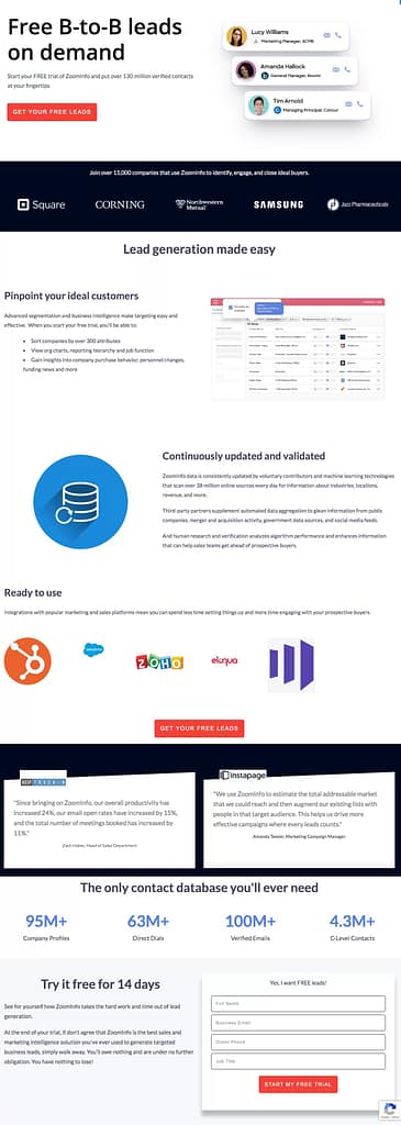
Let’s break it down section by section.
Hero Section
Which is easier: Convincing someone to buy a product or getting him to take something for free?
The answer seems pretty obvious. Yet many businesses make the offer more of an afterthought than a sales message.
Take a look at the hero section of ZoomInfo’s existing landing page. It’s all about the product except for one line of button copy. And frankly, even the copy about the product could use a bit of work.
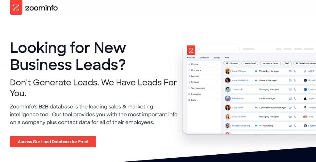
Question headlines are overused and often don’t provide enough reason to read on. It’s easy to just answer “yes” and be done. You need to provide more of benefit, differentiator or hook to draw the reader in. Give them some sort of indication that you can give them what they want.
The rest of the hero area is also too generic. Phrases like “…leading sales and marketing intelligence tool” have no meaning or impact without more context. How are you defining leading? What criteria are you using? Is this backed up by anyone else or is it just puffery?
Even the call-to-action, which finally mentions the free offer, lacks excitement. Access to a database isn’t really what the user wants. It’s more of a means to get what he wants: high quality business and sales leads. Always let your prospects know what’s in it for them.
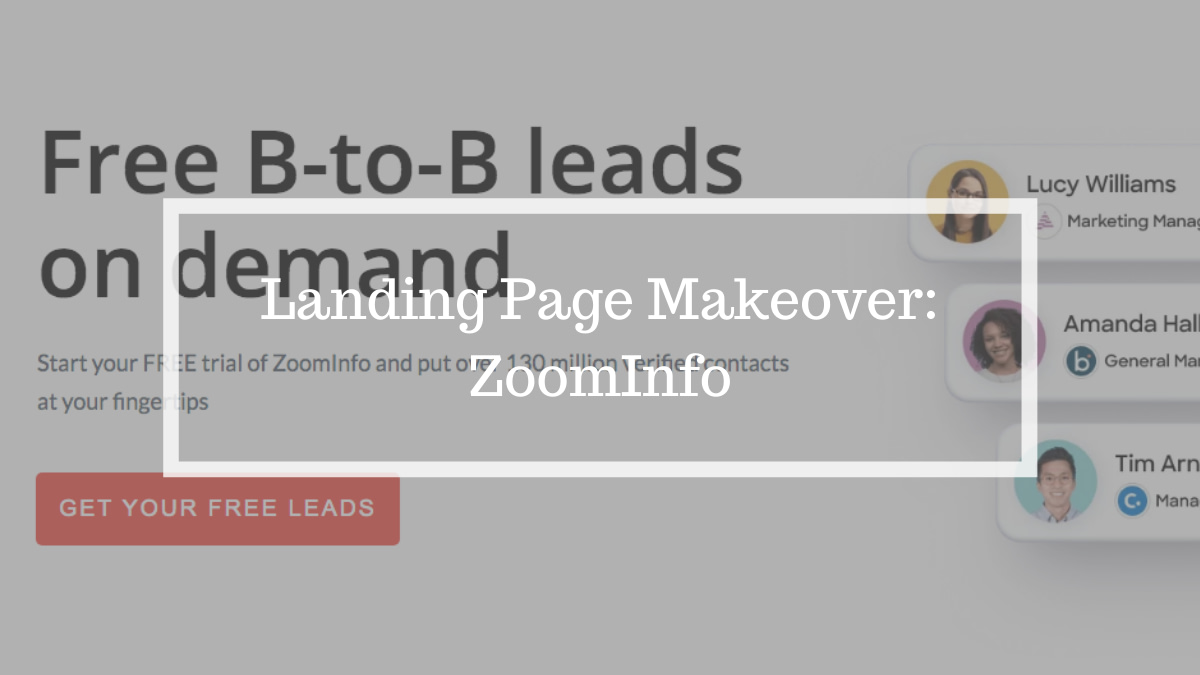
In my makeover, I bring the offer front and center with a headline that gets right to the immediate benefit. The subhead expands on that message with more specifics. And it leads into the call-to-action that says exactly why they should click the button.
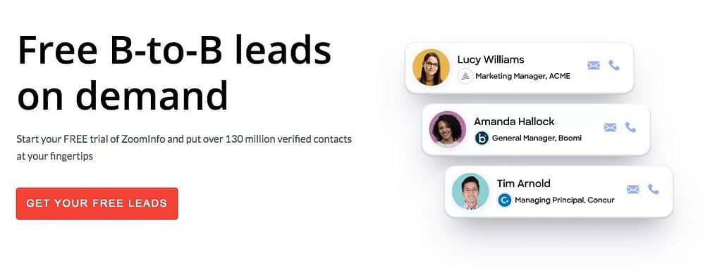
Notice how this new hero section conveys the benefits with specifics, not puffery. Instead of telling readers this is the “leading sales and marketing intelligence tool,” the messaging helps visitors come to that conclusion on their own.
Social Proof
The next section of the existing landing page is actually pretty strong. Showing the logos and providing testimonials of well respected customers is a great way to display social proof. The words and actions of others are inherently more credible than anything a company can say about themselves.
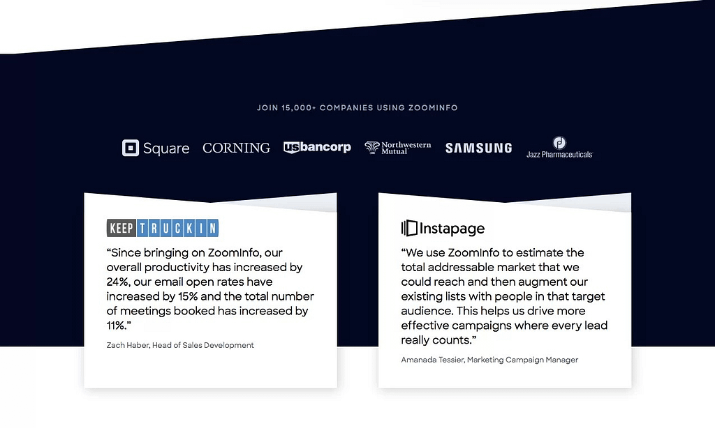
That’s why, in my makeover, I only slightly tweaked that section. I added benefit copy to the lead-in sentence to add context and build interest.

I also separated the logos and testimonials from each other. Having social proof in two spots is better than just one, and it calls attention to each individual element a bit more.

Features and Benefits
The current landing page doesn’t start speaking to what the users can do with this solution until the bottom half of the page. A good number of people who go to the page will never even see it.
And those who do make it that far only get a brief callout or two without any further context.
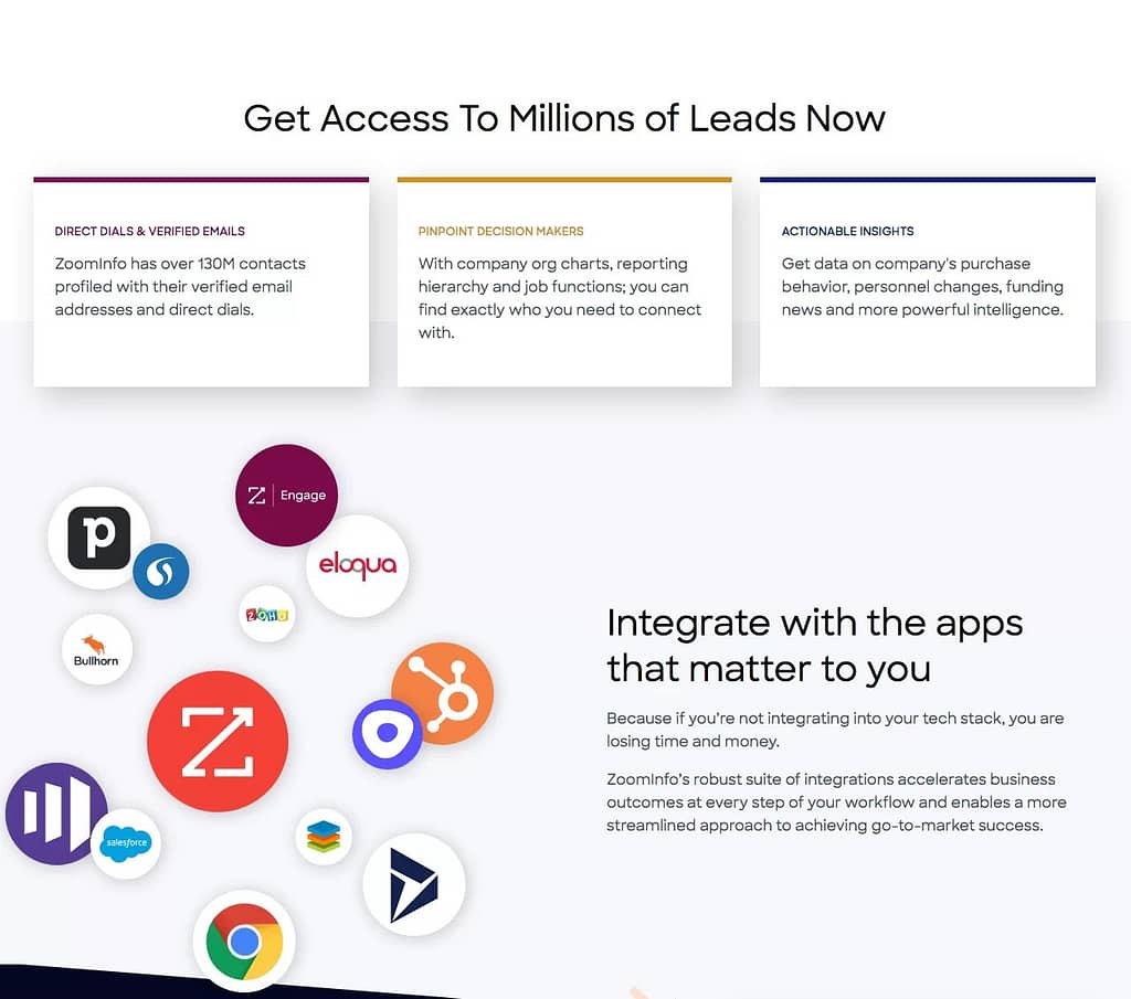
The makeover brings this information higher up to answer the main questions users have with almost any product promotion.

These supporting sections offer more detail and put it into context. It paints a more coherent picture for the user. If you rely on him or her to connect the dots, you’re creating needless friction. Don’t make prospects work.
Statistics
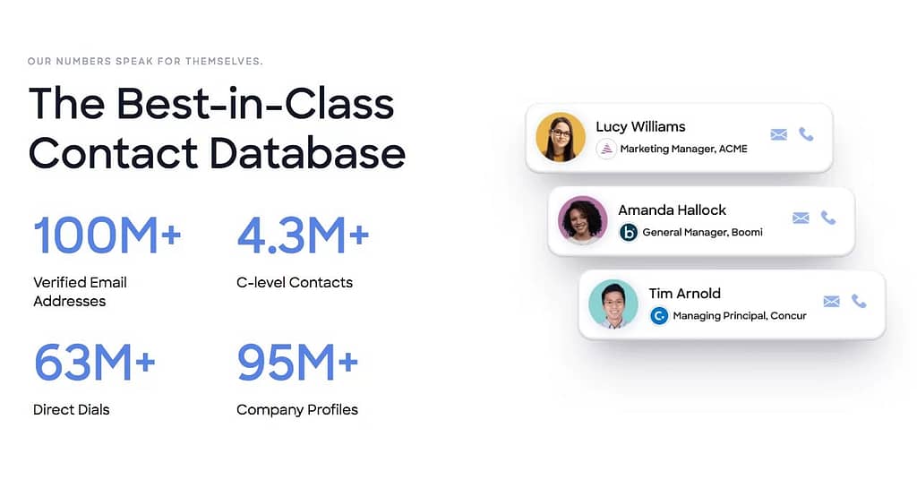
These statistics are good. Numbers are memorable and irrefutable. But the way they are presented in the current page misses an opportunity. It’s self-centered and lacks context. It’s just boasting, “look, we’re big.”
But why should the user care?

A simple edit to the heading completely changes the perspective. Now those numbers are about the prospect’s needs instead of the products attributes.
Call to Action
The call-to-action section is pretty standard. It’s not terrible, but it’s not great either. And since this is your last chance to get someone to act, you need to make the most of it.
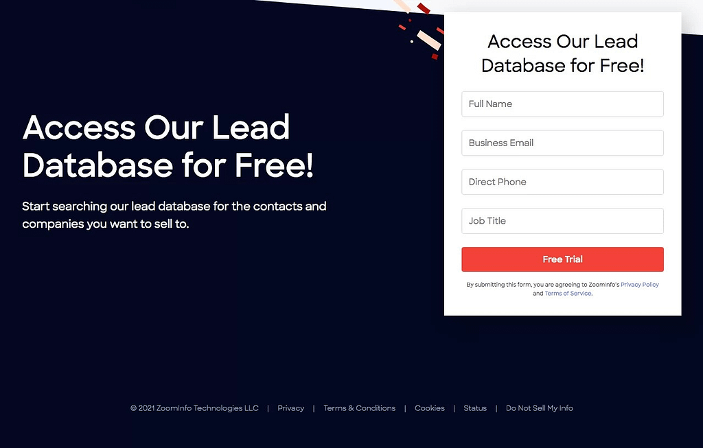
The makeover achieves this by reiterating the benefits and providing additional information to reduce remaining friction.
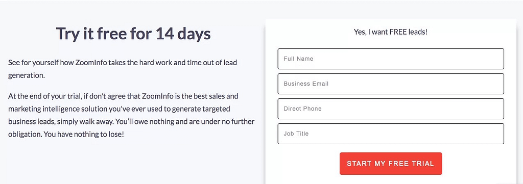
Specifically, the current page doesn’t indicate anywhere how long the trial runs. That’s a pretty important piece of information when deciding whether or not to move forward. (I went with 14 days because I found that on ZoomInfo’s main website.)
And I drove home the idea that there is no risk or obligation to taking advantage of the offer, so the prospect has nothing to lose.
Small copywriting changes make a big difference
One other big improvement that applies to the entire page is the tone of the copy. The current page makes two big mistakes that are all too common.
First, it takes a self-centered tone. Look how many times the words “we” and “our” appear. Prospects don’t care about you. They are about what you can do for them.
That’s why the remake switches the focus from the company to the prospect. Instead of “we” and “our”, the re-imagined page uses “you.”
Second, there is too much corporate-speak in the current page. Take this sentence:
“ZoomInfo’s robust suite of integrations accelerates business outcomes at every step of your workflow and enables a more streamlined approach to achieving go-to-market success.”
Nobody speaks like that. How many people will even understand what it means without re-reading it a few times?
Instead, sound like a person. Use conversational language that your prospects would use. It’s friendlier, easier to read and understand, and more persuasive.
Apply these lessons to improve your conversion rates
While there is no one size fits all for conversion rate optimization, the principles behind the improvements in this makeover are time tested. And they can easily be applied to almost any landing page.
Getting prospects to take action will still be difficult, but at least you won’t be making it harder on yourself.
If you’d like help optimizing your pages for conversions, please contact me.
Leave a Reply